

I saw this sign while cruising the PB website the other morning. My 14 year old daughter, Hana, is right. (Geez, it kills me to say that *sigh*) We do not have one single room in our home that has any kind of beach theme going on, nor do we live on a beach (45 minutes from the nearest one). BUT, I loved the look of the sign and wanted to see if I could recreate something similar. Besides, I had a plan to hang it above a hall mirror where we keep our beach bags packed and ready, so there, that kind of matches, right? I personally think houses that are too matchy-matchy are boring. Anyway, Friday morning my friend Sarah B. and I had a child-free morning, so we went to a thrift store and then hit Ikea. We got the BEST deal on a huge bundle of wood (random furniture parts) for $10!!! $10!!!! I have a picture of me with our giant stack of wood, but can not get it to send to my email from my phone. There were so many plain pine boards that we got tired of counting. No joke.

I picked some different sizes of boards, a couple had been oopsies, and laid them out to see how they would look together.

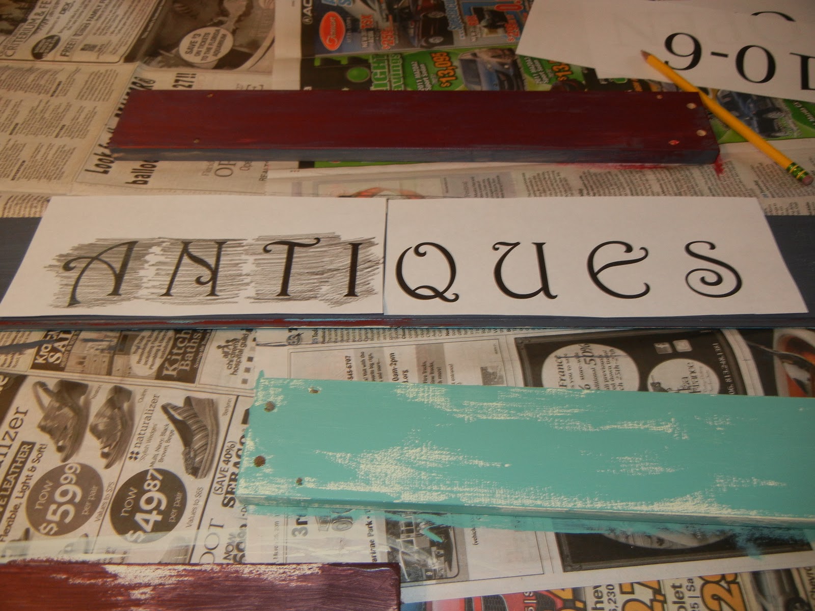
All my supplies are ready. I started with a layer of color that I wanted to show through the top coat when I sanded them to get an aged look. For the under colors, I used a blue-gray and off-white.
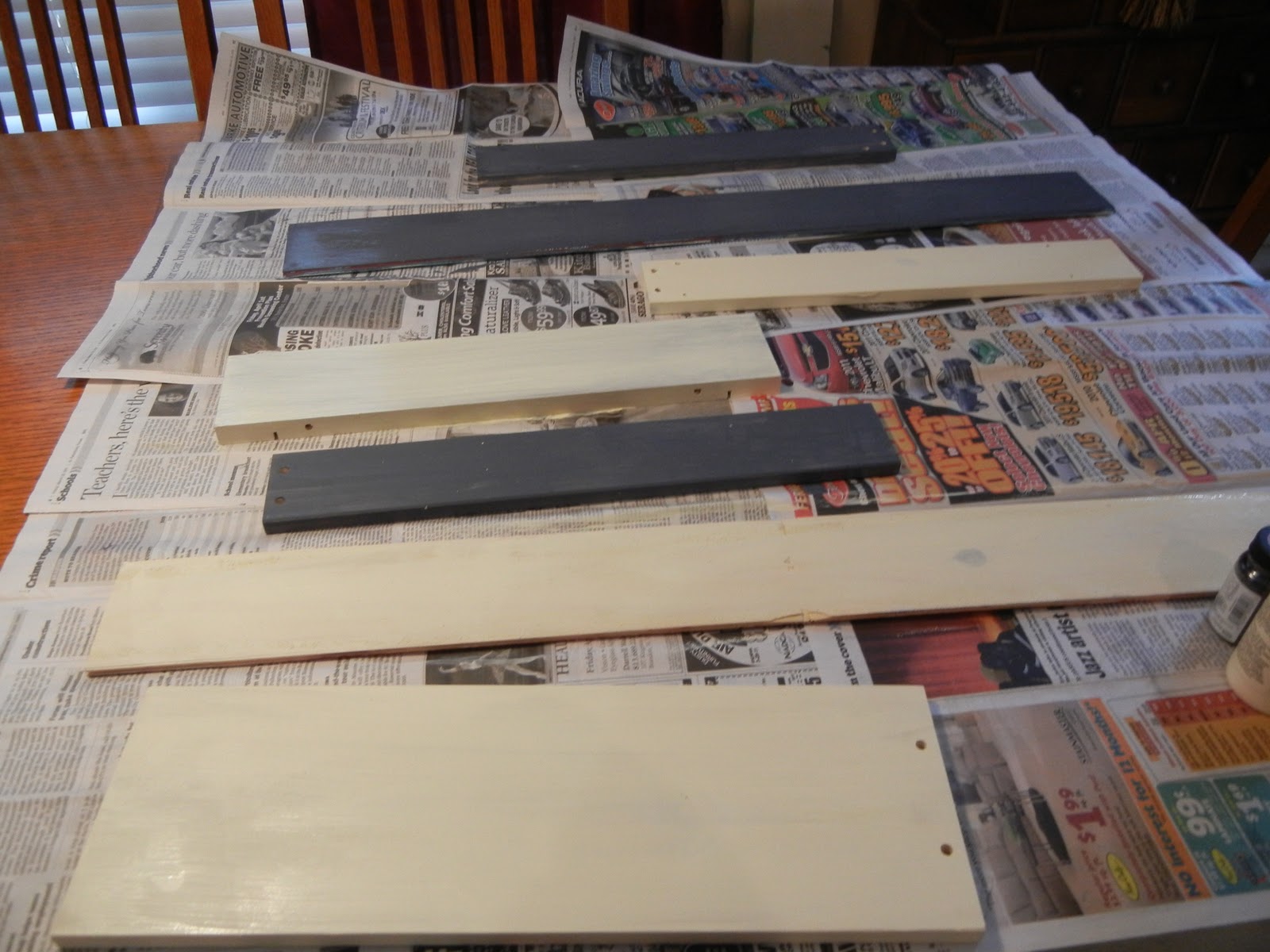
Some of the boards had pre-drilled holes in them. I could have filled them with wood filler, then sanded them, but since I was going for a weathered look, I kept the holes.

I did not do a thick under layer either. I really wasn't worried about the natural wood showing through the paint. Once dry, (which seemed to take fooorrreeevveeer) I painted on the top paint color. I used a red, off-white, blue-gray, aqua and a bright yellow. The yellow was an after thought...I was thinking it needed brightened up a little.

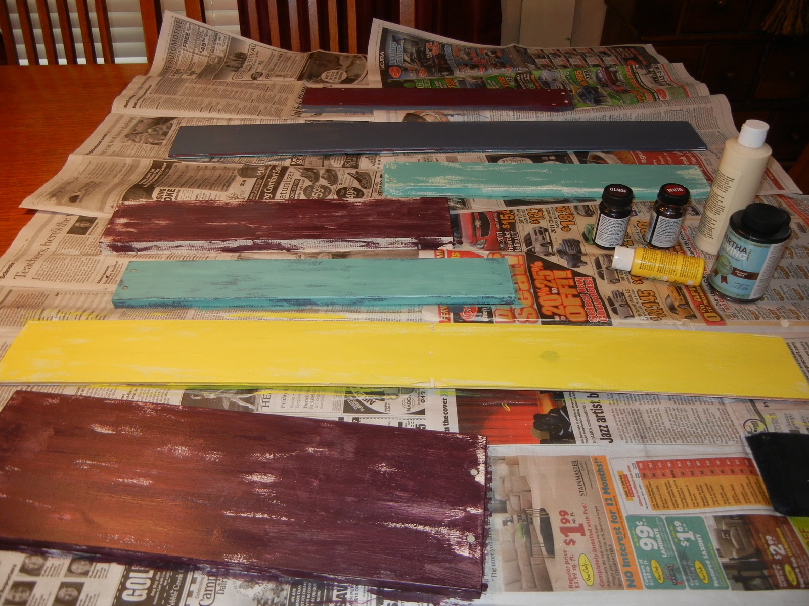
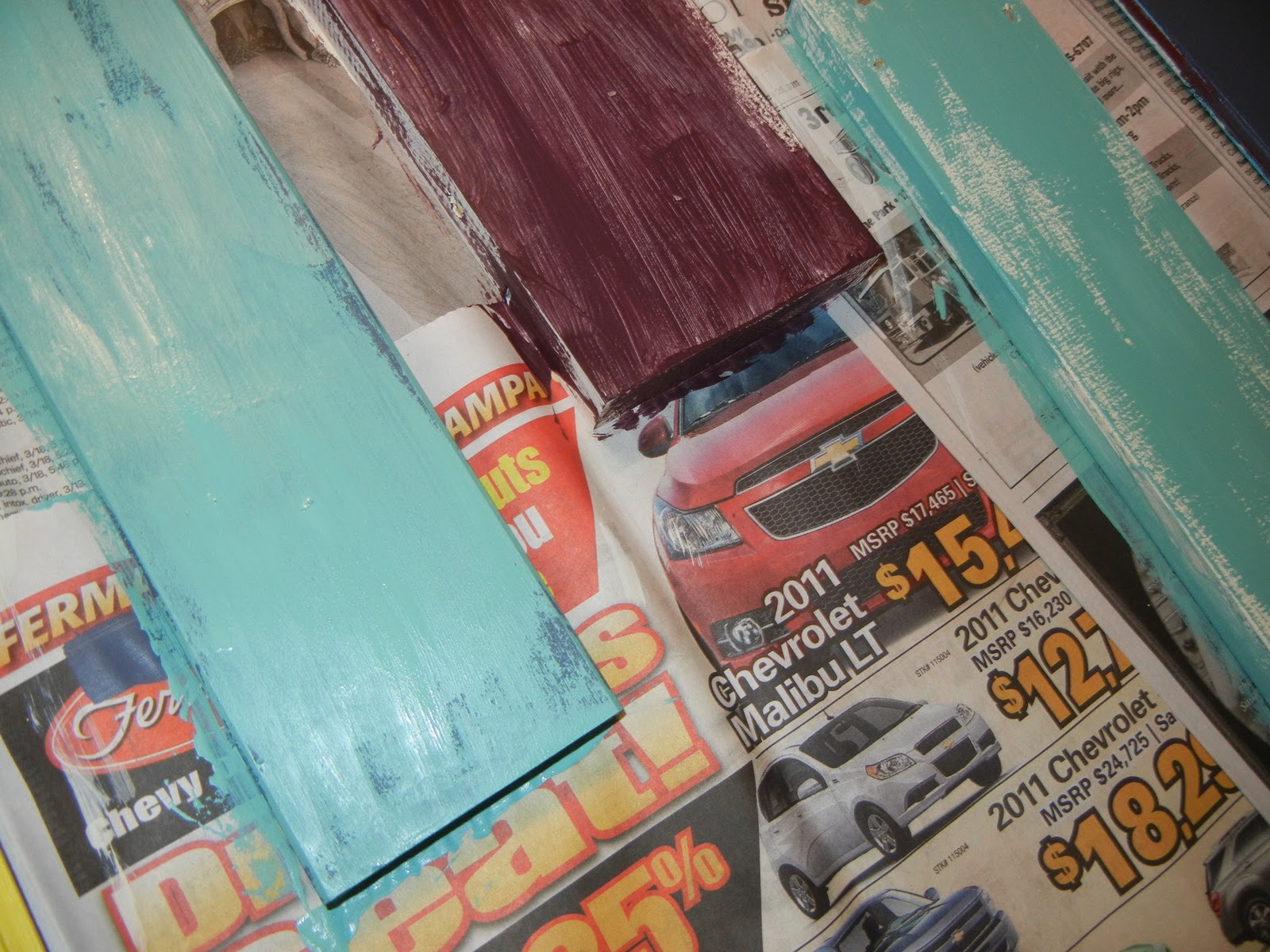
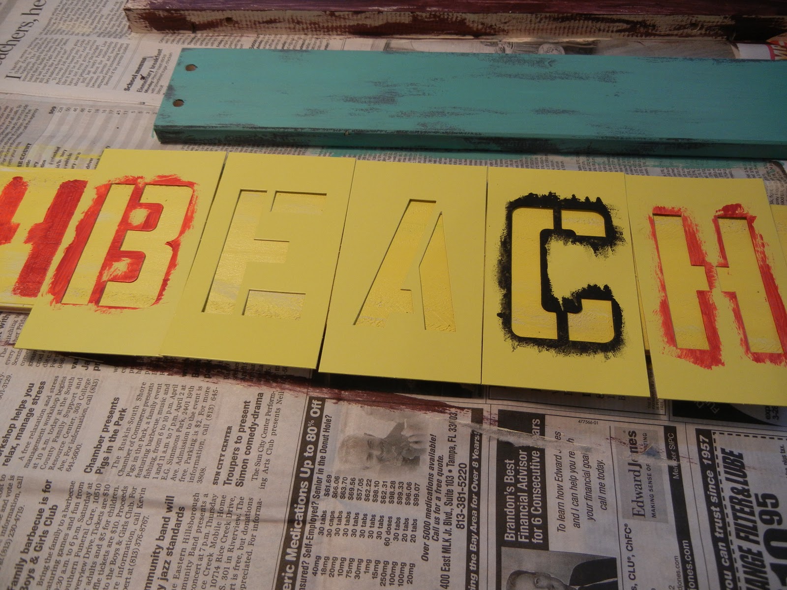
Once again, on the top coat, I let the under coat show to add a more weathered look. I then added some text by three different techniques. I used stencils to add "beach," a transfer method to add "antiques and open 10-6," and then free handed "Weathers" and the arrows.
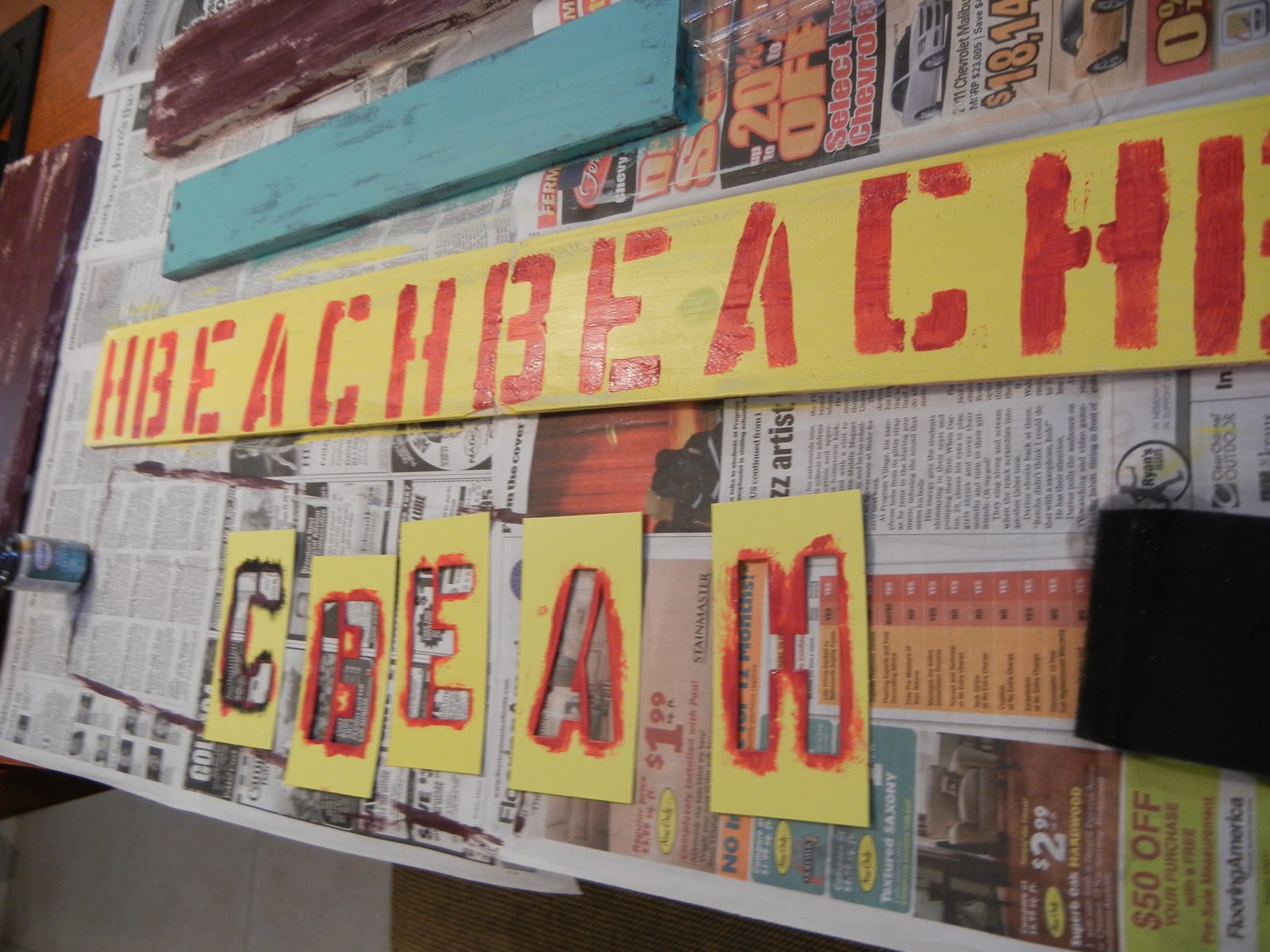


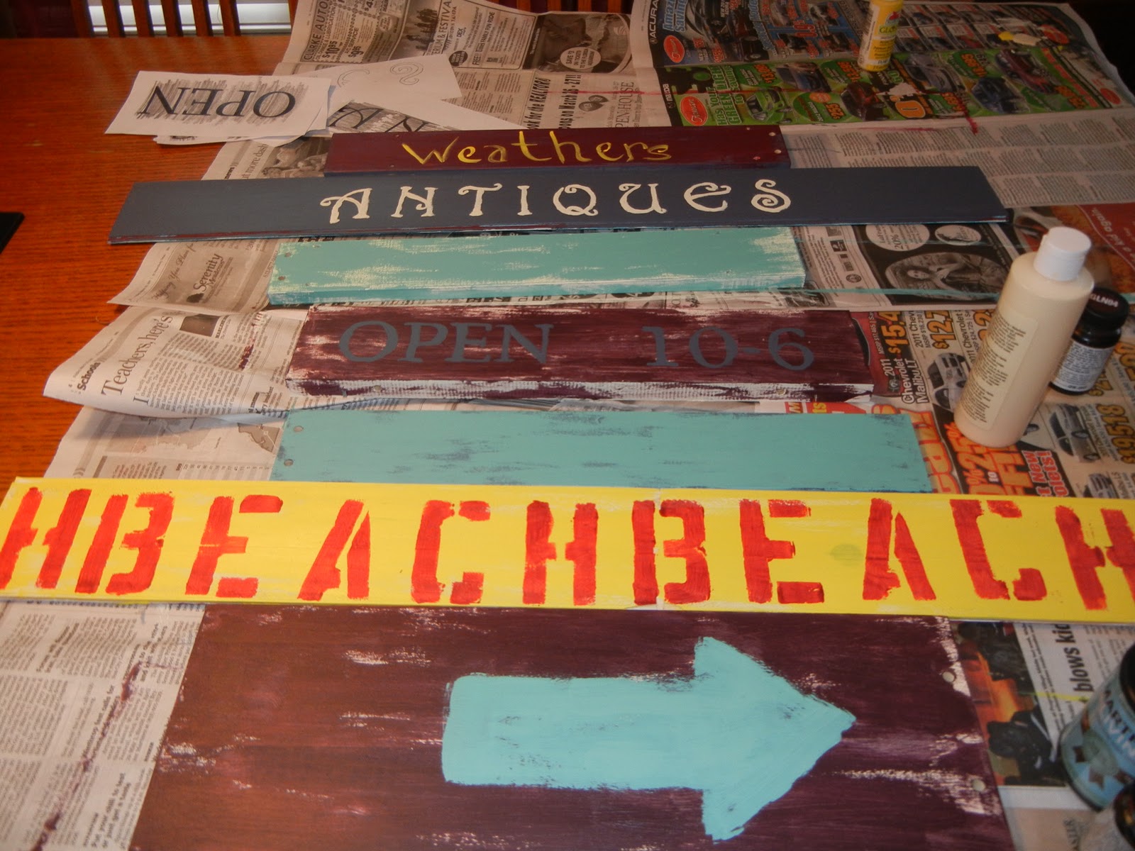
I then took all the signs outside to sand. I used my 3mm block sander with fine grit, but found that I really got the look I wanted when I went with a larger grit. I love the look of distressed or weathered or vintage looking pieces, but man! Sitting outside in the 90 degree heat, sanding my booty off was not my idea of fun! (Worth it, but not "fun"). This is the sign after sanding.

I was like, "woohoo!!!! Finished, now just put it together and hang!" Yeah, not happening so fast. I had to figure out how to hook all the pieces together first. I knew wood glue and screws would probably be involved, maybe a bracket.....wait...my husband left a tube of silicone adhesive. The "take the easy way" side of my brain won over my "do it correctly" side....silicone it was!!! After three boards that were either too short or too long, I finally decided to take another easy route and add a board to my design to accommodate a larger back board. I had a piece already painted red for another project, so I just added another arrow and then sanded it down.


I spread the back board with all of the silicone and stuck the boards in order. I put some heavy boxes on the top to help. I distracted myself for a few hours while it dried (man, that was painful, but my son really enjoyed the park. Waiting was painful, not taking my son to the park :) just to clarify). Oh! Before I put the pieces together, I added two sawtooth hangers on the back of the main board. Here is my finished product:


This piece is almost 31 inches tall, but only weighs about 5 lbs. No, I didn't actually weigh it and I may be off a few, but it is nowhere near the 33 lbs that the PB sign weighs. Their sign is also 57 inches tall (wow).
"It looks nothing like the PB sign. Gaw." Ok, Hana didn't add the "gaw," but it was implied through her tone. Once again.....*ouch, ouch, ouch,* she's right. BUT, that's okay because it is MY version. PB was just an inspiration. And, just a tip, measure the spot where you think you want to hang something FIRST. I didn't. I don't really think like that. I get an idea, then I run with it. So, the sign is too tall to fit where I had envisioned it and now has it's home above the loveseat in the "pool room." I'm okay with it right there for now....mostly because it's on a wall that is not easily seen. I will find a place for it.....eventually.
I've linked up to I Heart Naptime Sundae Scoop
I've also linked up to Under The Table and Dreaming
I've linked up to I Heart Naptime Sundae Scoop
I've also linked up to Under The Table and Dreaming
Linked up to Funky Junk Saturday Nite Special
Have a great Saturday night!
BTW, it looks MUCH better in person and I am not a professional photographer. I barely know how to use the camera I'm borrowing from my daughter, Haley.
I love your blog lady!
ReplyDeleteCute! I saw this in the Pottery Barn catalog and want to attempt it too. You did a great job =)
ReplyDelete